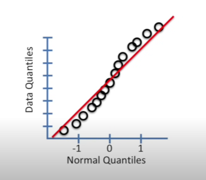
Q-Q plot
A Q-Q (quantile-quantile) plot is a graphical tool used to compare the distribution of a dataset against a theoretical distribution (e.g., normal, logistic, exponential). It helps assess how well a given distribution fits the data.
How Q-Q Plots Work:
- Sort your dataset → Compute the sample quantiles (percentiles).
- Compute the theoretical quantiles → Take the same number of points from the theoretical distribution (e.g., normal, logistic).
- Plot sample quantiles vs. theoretical quantiles:
- If the points lie on a straight diagonal line, the data follows the theoretical distribution.
- If the points deviate significantly, the data does not fit that distribution.
Interpreting a Q-Q Plot:
- Straight diagonal line → Data follows the chosen distribution.
- Curved S-shape → Data has skewness.
- Upward curve (right tail high) → Right-skewed.
- Downward curve (left tail high) → Left-skewed.
- Heavy tails (outliers) → Points at the ends deviate from the line.
- Light tails (thin-tailed distribution) → Points at the ends fall below the line.
References: